Thursday, 8 October 2015

photoshop edit vintage

I took a picture of the ground and merged it with a picture of the weir in Bath. to create a vintage looking postcard. I did this by adjusting the opacity and adding several filters: half-tone and vibrance. To create the finished effect I rubbed out the lake to create contrast within the image. I think that there is room for improvement on this picture to make the colours brighter as the image at the moment is quite dark and not that colourful. To illuminate this problem I would introduce a lighter filter.


Tuesday, 6 October 2015

typography

Typeface and Fonts.
A typeface is a piece of writing that is often used in logos, signs, and headers. Typefaces are more fancy and eye-catching than fonts. Fonts are used for writing and are easier to read than a typeface. Fonts are aesthetically easier to read because they are more simplistic designs.


And a
Font


Serif and Sans-Serif

And a 

What is Egyptian and Slab Serif?

In typography Egyptian or Slab Serif is a type of serif typeface formed by thick, blocky 
serifs. 

Uncial is a script written in the 4th to 8th century AD in Latin and Greek.


Type Family
Kerning is when the space in between two letters in the word is different to the space between the other letters in the word.


Tracking is when all the letters are equal spaces apart.

Leading


Analysis
Empire Magazine The Evolution of Superman article
The typeface on the right side is comic book style fitting with the subject of the article and the target audience(teenagers onwards). It's eye-catching partly down to the contrast of the white typeface on the yellow background. It's slightly italic which makes it informal. The slight shadow gives it some depth and a 3D effect. The font on the right side which is the colour black is in my opinion a bad colour choice as it doesn't quite work very well with the yellow and makes it quite hard to read. To improve this I would choose a different colour such as white with a slight black shadow similar to the typeface header.


Star Wars Magazine The Forces Of The Empire Article
This article has a bold typeface header. I think the colour contrast works quite well, the blue and the grey. It is sans serif and quite easy to read. The sub-headers are yellow on a red background. I think the red symbolises warning/evil in this case the Star Wars empire (bad guys) which the article is about. The black font on the red background is very hard to read also the word spacing is very close together, this results in blocky and claustrophobic text that is not easy to look at.

Grid

Grid is a spacing and skeleton of a page to give the page structure. The grid is made up of vertical and or horizontal lines and in some cases the lines can be curved, these are used to give structure to the aesthetics of the page. The hierarchy comes into it when the most important thing on the page is positioned in a place of importance such as at the top of the page in bold. Hierarchy also gives structure in the page to help you position and visually see where everything should go and where it should be placed.  Grids can be used in graphic design, handwriting, and typed. There are different types of grid:

A Modular Grid is horizontal and vertical lines that are placed top to bottom on the page. Modular Grids are usually used for graphic design such as photoshop for text this grid gives you more space and more freedom to arrange the page there's near infinite combinations of layout. 


A Multi-Column Grid works well with pages with text in. Most columns have different sections of content. The more multi-column grid is usually used in newspapers, magazines, and leaflets.  

A Single-Column Grid is usually a block of text. Commonly used in formats such as books. I think they use this to fit as many words on a page at once.


Hierarchical grids are commonly used on web pages with different proportions of images and text. Hierarchical grids are good when a project requires an odd grid when the document requires an alternative design that would not fit into the other grids. They separate themselves from the other grids because they have no structure and are not symmetrical.


Storyboards

Screen Shot 2015-10-01 at 09.54.56.pngScreen Shot 2015-10-01 at 09.55.07.png
The storyboard is a key part of film-making. The earliest storyboards date back to the 1920’s in the early Mickey Mouse animations. They are a representation of what is to come in the film and helps communicate between different departments of film-making and also a good storyboard artists needs to communicate ideas clearly but doesn’t need to be a good artist. Storyboards are  cheap and easy way to edit and cut a film before it’s even been made. It’s also a good way to pitch a film to a production company because it gives a quick and cheap vision of what the film could be.

A storyboard is important because it helps to let everybody know what they are doing, including the actors, the director, the crew, the cameraman, etc.If there’s no storyboard the film would be inconsistent and a jumble of scenes.

short film

The Film

The film I studied is called The Deposit. It stars out with somebody trying to withdraw money then a heist takes place. The staff at the bank retaliate against the robbers and end up killing all of them

I think the film was okay,

Thursday, 1 October 2015

Bath postcard review

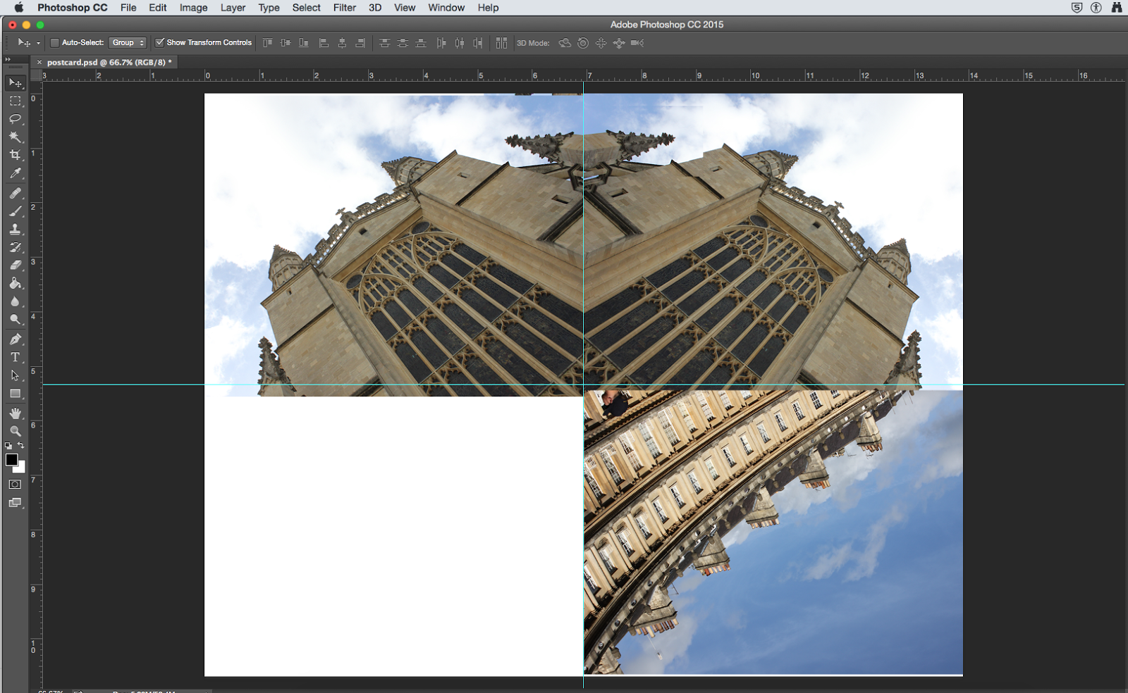
What works well is that it's symmetrical. I used two images, the top one was flipped horizontally and then the bottom one was flipped vertically and horizontally. I cut out a part of the image to make it line up using quick selection to cut part of the image out and paste it on the other side to make it line up. I used Dafont.com to get the font for Bath. My target audience is older aged tourists

It is slightly blurry around the text because I took a screenshot from Dafont rather than downloading it. The images don't properly line up under close inspection because the images are from slightly different angles and flipped so they aren't perfect


I moved the rulers into place to ensure that each picture was equally spaced

I placed two images in to experiment with the spacing of the images

I realised that the picture on the right needed to be the same as the other one on the left to create a more effective design 

I thought it started to look like a heart. I like that because it represents "Love Bath"

I duplicated the bottom image to perfectly form the heart shape

I placed a Bath typeface on the image

I placed the same typeface but in white on top to give a 3D effect


I like that it represents "Love Bath". I also like that it's symmetrical. 


This one doesn't go together that well because the images don't link in together.  It's a bit jumbled with colours and I didn't put much thought into how to place the images. If I was going to improve this one I would link it in and think about how the colour contrasts work. I would choose better images that link in more with the subject


Bath postcard image review


Both images are very similar because they both use near perfect symmetry. The focal point is the middle of the image, on the photo that I have taken it is the window. On the Grand Canyon image the focal point is the central peak. The Grand Canyon image uses depth of field along the bottom to give you some perspective of how far away the central peak is. My image uses a low angle perspective to show that the window is high up.
 The light on both images is coming from the right side and on the Grand Canyon image it's casting a shadow on the left side, this causes atmosphere.


Both images show rule of thirds, and are very well framed


i have got this image from here

Reflection on last lesson


I learned about primary and secondary research, geodemographic means that a specific product may be aimed at an audience in a specific place. Demographic is about individual people, their background, religion, gender and likes and dislikes.

We also market researched different types of postcards to be inspired to create our own. We also went out to take pictures around Bath and we will later incorporate these to create our own.