Sam-G-Media
Wednesday, 25 May 2016
Tuesday, 24 May 2016
evaluation for project FMP
Does your finished product reflect what you originally set out to do?
I set out to do an advert for Planet Games and I achieved this goal butI had to make some compromises (see the other scene specific evaluations).
I set out to do an advert for Planet Games and I achieved this goal butI had to make some compromises (see the other scene specific evaluations).
What did you struggle with? - be honest and specific.
There was some trouble waiting for them to get back to me as it took a few weeks and I had to reschedule shooting for the other scenes.
I struggled with the interview because I didn't do enough planning for it
What did you enjoy and why?
I enjoyed learning After Effects (using youtube tutorials, practise and teachers advice). I also enjoyed the filming and post production, and producing each distinctive scene and making them look as authentic as I can
What could you improve on and how?
I only ended up asking two questions during the interview so next time I would choose the wording of my questions better. I was also very nervous during the interview and it is something I need to practise. I should have asked about the history of Planet Games. I also only asked closed questions so the interview wasn't as in depth as I'd have liked it to be.
Because it took a while for contact between myself and Planet Games, next time I would go and see them personally to arrange an appointment as well as phoning.
If you were to do this project again/had more time and resources what might would you do differently?
(see the other scene specific evaluations)
(see the other scene specific evaluations)
Are you happy with the final product?
I'm pleased with the outcome and the distinctive aesthetic to each scene.
Necessary skills for FMP
I need to develop my After Effects skills because I haven't used it very much before. This will mean I can present my idea, the transitions, and the games themselves. I also need to do green screen. Below is the sort of effect I'm going for for the first-person segment of my film/advert. I'll need to superimpose copyright free green screen effects into After Effects. The way I'll go about learning these skills is advice from tutors, youtube tutorials, and practise/test footage
For the beginning and end (if Planet Games don't get in touch), this is the effect I will use. There are two ways of doing it: the way which will be easier and more effective is using After Effects headtracking software, which I would have to go about finding how to do this with tutorials. I could do it frame by frame on Photoshop too as I have used a similar technique on a previous project this year (The Agents). If these don't work or take too long I can use an actual box and draw on it.
 If I cannot figure out After Effects and get to grips with the software for teleporting into the game I will have one shot with the character in front of the computer and a shot with the character gone, but the ideal effect I want if I can get to grips with After Effects would be a shot of the character minimising and getting pulled towards the computer
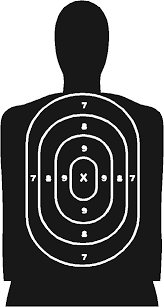
 For the first-person segment I plan to use Flash and I may have to use photoshop to 3D animate the target popping up. They will pop out from behind trees.
I plan to use Flash for the platformer scene. I'll have to learn how to take the green screen background out of the photos before I animate the scene. If this does not look quite right, I'll have to see what other software will enable me to do this.
If Planet Games don't get back to me, for the ending, I'll have to create the characters that escape from the screen on Photoshop or maybe use the WACOM tablet. I might also have to learn how to pixelate some people on Photoshop or whichever program allows it.
For the beginning and end (if Planet Games don't get in touch), this is the effect I will use. There are two ways of doing it: the way which will be easier and more effective is using After Effects headtracking software, which I would have to go about finding how to do this with tutorials. I could do it frame by frame on Photoshop too as I have used a similar technique on a previous project this year (The Agents). If these don't work or take too long I can use an actual box and draw on it.
 If I cannot figure out After Effects and get to grips with the software for teleporting into the game I will have one shot with the character in front of the computer and a shot with the character gone, but the ideal effect I want if I can get to grips with After Effects would be a shot of the character minimising and getting pulled towards the computer
 For the first-person segment I plan to use Flash and I may have to use photoshop to 3D animate the target popping up. They will pop out from behind trees.
I plan to use Flash for the platformer scene. I'll have to learn how to take the green screen background out of the photos before I animate the scene. If this does not look quite right, I'll have to see what other software will enable me to do this.
If Planet Games don't get back to me, for the ending, I'll have to create the characters that escape from the screen on Photoshop or maybe use the WACOM tablet. I might also have to learn how to pixelate some people on Photoshop or whichever program allows it.
The levelling up section will be the transition between each game. I will try to create the logo on Photoshop and then make a game menu (also on Photoshop but animated on Flash) so it looks like a game is being selected and then played.
Monday, 23 May 2016
FMP fighter process and evaluation
I recreated the coin in 3D using photoshop by merging the layer to 3D then frame by frame rotating the coin and saving each frame as a PNG. I then imported each frame to Premier Pro. I shortened the duration of each frame and then sped up the entirety of the slide show. If I was going to reanimate the coin, I would keep the pound sign the right way round on both sides. I had to remove a frame from it (the pound sign the correct way round) for the final product as it didn't spin properly.
 I made the health bars in Photoshop. I overlapped the yellow with the red and then minimised the yellow bar frame by frame to coincide with the fight.
For the fight scene my influence was stop-start animation which links in to the original Mortal Kombat game. They used images of real people in fighting stances. The first thing I did was to take lots of photos.
Once I had all the photos, I created a Premier Pro project. I created two separate stop-motion fight animations simultaneously in the same document because Premier Pro prevented me from having two documents open at the same time. I selected a series of photos for the animation of one fighter and then did the same for the second fighter, making sure that his moves matched up to the actions of the other fighter. This took a very long time. When I was done getting each fighter matched up I exported each fighter's moves separately and had two separate video files.
It was very slow to edit because there was over 30 images and they were all big files. If I was going to do this again I would line the two characters up with the centre of the screen and have the punches/moves match up better with the opposing fighter.
The background I used was a picture I took in Bath city centre. I chose this one because I like symmetry of the image and with Streetfighter and Mortal Kombat there are arenas in unusual places as below. I also like the depth of the image which gives it a 3D perspective.
image
image
I imported this (copyright free) special effect (and the finale explosion) from youtube and then key lit them to eliminate the green screen
I downloaded the bloody font from dafont (copyright free).
I am happy with this scene, but I would make alterations to the coin as said above, add a black shadow to the font to make it stand out, and remove the "player 1/player2" as I don't think I needed them. I would also change the number of frame for the character on the right because it looks like he's only using one hand to punch.
I like how the health bars are in synch with the punches. I like the background as it gives depth, and I like the actions of the characters.
Thursday, 19 May 2016
FMP platformer process and evaluation
I created the platform background on photoshop. The design is simple because it is based on Super Mario Bros 2
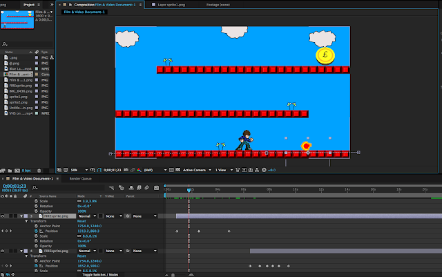
I decided to put a question mark above his head because it helps with making the transition clear that I was sucked into the game and puzzled as to what's going on.I created a position keyframe and set the start and end points as seen on the timeline below
When the character jumps, I modified the sprite by moving his legs into his body to give the illusion that he's bracing to jump.
The movement of the character and the fireballs is done by using positioning keyframes (After Effects) and moving the points closer together to adjust the speed where necessary.
I dislike the second platform row when the character jumps to the third platform because I was unable to get the jump smooth enough and he clips the platform. In future, I would adjust the path that the character jumps on and lower the distance, the third platform and the way he jumps.
The coin was created with photoshop and is featured throughout my FMP.
The effect of the shrinking coin was done using scale and position.
I used the copyright free green screen video effect from youtube and then used keylight 1.2 to take away the green screen.
I had a photo of me taken from the upcoming fight scene
In the video cassette green screen copyright free effect there was a wipe that I adjusted using keyframe opacity to give the illusion that the wipe is taking the character with it to the next level.
To create the fireball, I used photoshop. I cut out the head of the sprite, turned it 90 degrees and then recoloured it and duplicated it three times with different colours to create a retro fireball.
I found this sprite on deviant art, then traced it and inserted colour into similar places as the original to get the retro effect. I
I am very pleased with the outcome of this scene (except for the issue above) and making a better walking animation for the sprite so he isn't just sliding. Otherwise, it came out as planned.
The music in this scene was 8-bit style copyright free. This fits the scene as it was 8-16bit style. The coin sound effect also represents retro gaming and was sourced from freesound
ending process and evaluation
This is the ending. It was shot in Planet Games (Bath), having received verbal and written permission (evidence in previous blogs) to use the store, their logos and the staff member's image.
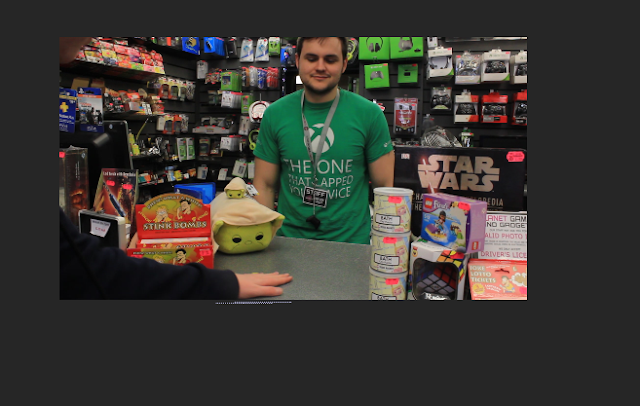
In After Effects I duplicated the video and then used the roto tool to highlight whilst cutting round my arm.
I placed the coins inbetween the cutout arm and the background, which gives the illusion that I'm placing them on the counter.
If I had the opportunity to do this project again, I would find a more suitable colour background. To get this colour I used Adobe Kuler to find a complimentary colour for the pink in the logo then brightened the background. I would have preferred to use just black or white.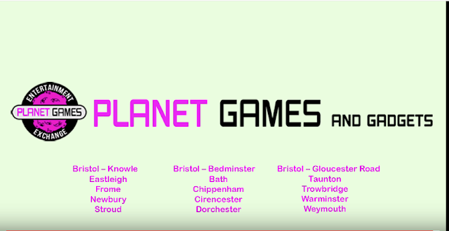

This is the original ending scene, but I reshot it because the background sound levels were too loud and it was hard to distinguish his voice and the music. I tried masking the background music with Post Production music but the voice was too distorted. For the reshoot, I asked them to turn the music off and discussed exactly what I wanted them to say.
Subscribe to:
Comments (Atom)


